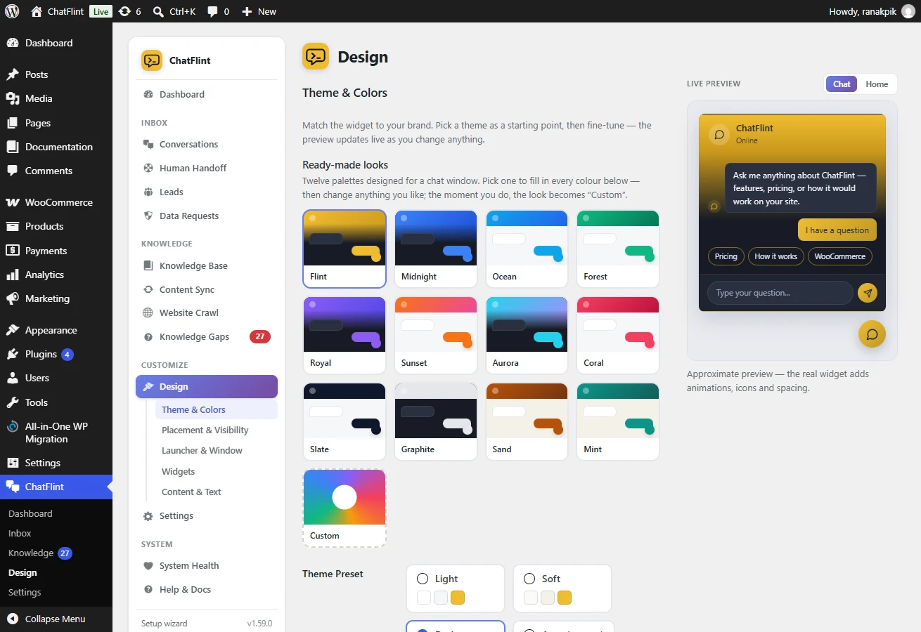
Where it is: Design → Theme & Colors.
Everything visual is under Design, with a live preview beside the settings.
- Presets — light, dark and soft, or automatic following the visitor’s system setting.
- Colours — header, bubbles and launcher, with text contrast chosen automatically so you cannot end up with white on yellow.
- Shape and size — corner radius, launcher size and icon, window width and height.
- Avatar — an image or the built-in mark, shown beside every reply.
- Font scale — for sites with unusually large or small body text.
It will not inherit your theme’s CSS
The widget is style-isolated: rules from your theme cannot reach inside it. That is deliberate — it means the widget looks the same on every site, and a theme update cannot break it.